Photos: Perry Smith
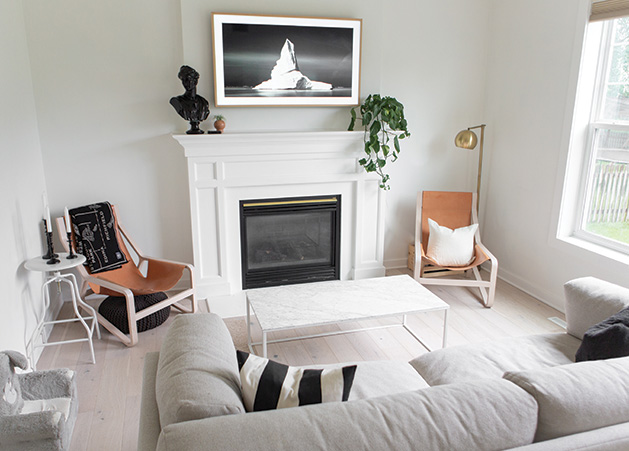
The Smiths turned a mismatched space into a cohesive, modern living quarters with a little DIY home renovation magic.
Mariah Smith and her husband, Perry, moved to Maple Grove in 2017 in hopes of creating a family-friendly home. Upon settling in, the Smiths realized that their new dwelling did not quite feel as inviting as they wanted it to be.
Mariah described the original vibe as old, dingy and outdated, which simply did not fit her clean, effortless lifestyle. Embellished with golden oak trim, beat-up hardwood floors, grungy carpet and, in every room—colored walls, from red and yellow to brown and blue. The Smiths knew they wanted to opt out of this mismatched early 2000s style. Taking matters into their own hands, they decided to tackle a majority of the renovations in the house by themselves.
Mariah was always interested in arts and crafts and had a fondness for hands-on projects. Using her creative eye, she developed a mood board that compiled her favorite household features, colors, textures and furniture pieces as a source for her renovation inspiration. With a background in video production and her husband being a professional photographer, they needed to create a space that would emulate their artistic personalities and innovative styles. “The space that you are occupying should show what you are interested in. It must be an expression of who you are and what you are comfortable with,” Mariah says. “I feel more relaxed when I am in a space that inspires me.”
From a mismatched space to cohesive, modern living quarters, the couple takes pride in its victorious transfiguration and urges others to do the same. “You almost don’t really have an excuse not to do it, and there are so many resources available for you to learn,” Mariah says. “I think we surprised ourselves by how much we could do and … how much money we saved.”
Lighter is Brighter
With a north-facing house, the space isn’t able to enjoy the benefits of consistent natural light. In order to combat this issue, Mariah settled on painting the entire home, with the exception of her daughter’s spring green nursery, white. With a muted tone, the color elicits a brighter feel, as it provides a way for the minimal amount of available natural light to reflect off of the walls and radiate throughout the home. Mariah believes that this was a simple alternative to opening up the space in a “minimal, yet impactful” way.
Before
After
Outdated to Outstanding
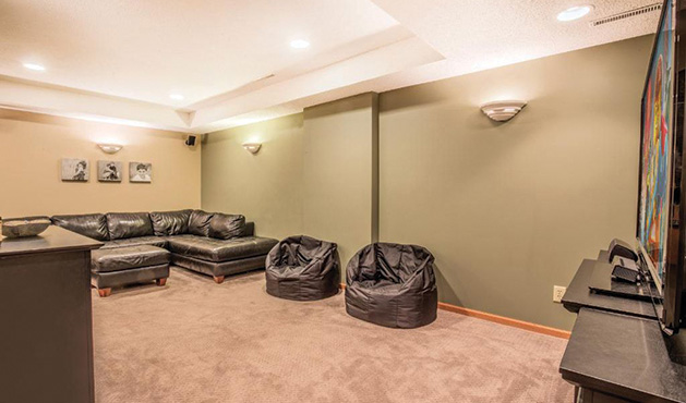
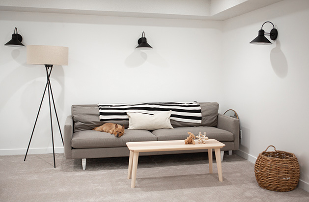
Described as one of Mariah’s favorite transformations in the house—welcome to the basement. The space once embodied deep red and green walls, golden oak trim, matted brown carpet and five obsolete wall sconces. Attractive—perhaps at one time, but the lower level didn’t age well. After the renovation, the space is now resplendent with sleek, light-wash hardwood floors, updated recessed lighting and crisp white walls to make it feel less dungeon-like and more on trend and inviting.
Layers upon Layers
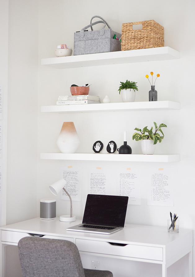
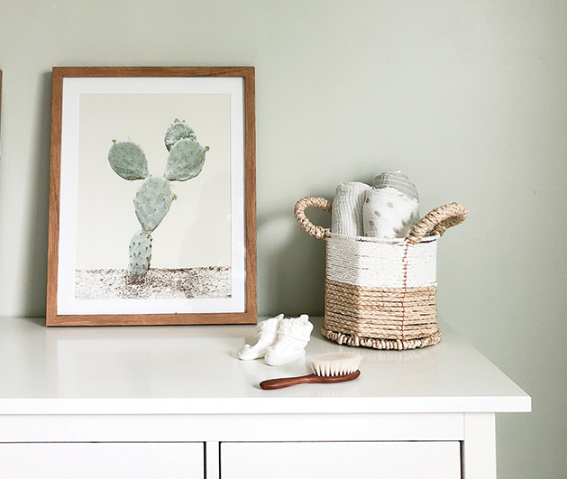
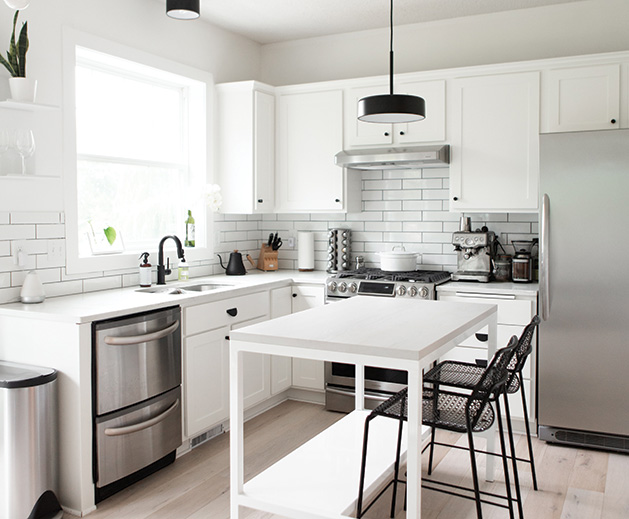
Though a simple black and white color palette evokes a clean, modern aesthetic, it can often read as stark. In order to make this contemporary approach feel a bit more like home and add visual warmth, Mariah utilized a variety of textures to create interest. From woven baskets and linen or knit fabrics, the contrasting materials cohesively blend to create the desired effect. The addition of a few houseplants helps bring life to the space, and they provide a pop of fresh color to the neutral palette.
Before
After
Less is More
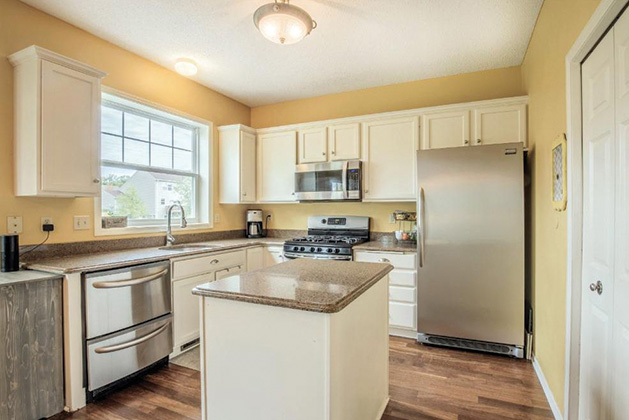
To maintain the clean-line aesthetic in the kitchen, Mariah opted for white subway tile for the backsplash. Together, the aligned rectangles provide the perfect backdrop for decorative accents and architectural features. Carrying this timeless color scheme throughout the rest of the kitchen, Mariah and Perry selected white quartz counter tops as a low maintenance alternative to marble. She credits the stunning outcome to Twin Cities Granite, one of few places she went for assistance in their hands-on home renovation.
Click-and-Place
The floors went from golden-brown hardwoods to smooth, gray-wash click-and-place floor boards with crisp white trim. For Mariah, this change was one of her favorites, as the color alone single handedly softened the entire space.
Gather Round the Table
Mariah Smith always had a love for pottery and thoroughly enjoyed creating bowls of her own in her high school art classes. As she grew older, that love for making bowls coincided with her passion for collecting cute, decorative kitchenware. Combining her love for art and practicality comes Gatherware—an artisan bowl company that “focuses on creating pieces for people’s homes that are an expression of a fun, poppy and modern lifestyle,” Mariah says.
Each kitchen creation is handmade, decorated and packaged in the comfort of her Maple Grove home. The bowls come in white with a choice of hand-painted black or copper-toned polka dots. In addition to her original line, Mariah also offers quarterly limited edition bowls that feature fresh, new designs to keep consumers on their purchasing toes. (Using Instagram as her driving platform, Mariah posts images of new dishware once they are available for purchase.) “This was bigger than I thought it would be,” Mariah says. Within the first three days, after she posted her debut round of creations, they sold out.
With each batch of bowls, comes high demand and a long waiting list, but, for Mariah, this is just another means of perfecting her craft. Though it is a nice side hustle, Mariah prefers to view her booming business as a way for her to do something that she loves without turning it into a stressful hustle.
Instagram: @gatherware


