Photos: Scott Amundson
Designer provides the perfect equation for décor presentation.
When it comes to feathering our nests, decisions abound. While major elements might take the front seat, it’s important to tend to the smaller details, which can make or break a design story.
To say it’s all in the presentation might be an understatement when it comes to hanging art or other décor elements and lighting fixtures. Yet, many homeowners stumble when it comes to knowing the ins and outs of properly presenting these elements.
For tips, we turned to Carly Loobeek, an interior designer with Studio M Interiors in Plymouth, who recently worked with Jeff and Carrie Jacobson. The couple’s Osseo home suffered fire damage, necessitating interior updates. “Everything from the floors to light fixtures had to be changed,” Loobeek says. While the scope of the project was wide, let’s focus down on wall décor and lighting.
Maple Grove Magazine: Is there a hard and fast rule when it comes to hanging wall art?
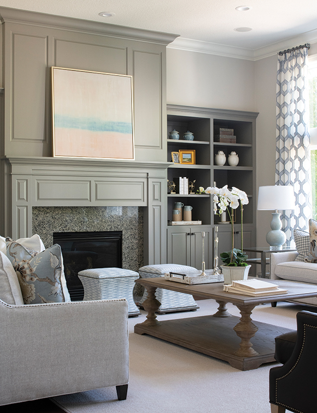
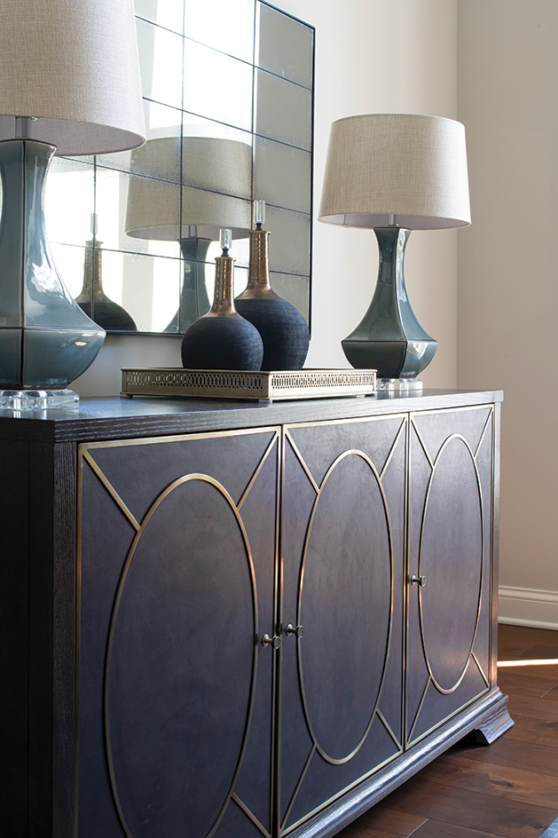
Carly Loobeek: Every home and project is so different. One guideline to follow is mixing up the types of art used. For example, this home’s open concept uses framed stretched canvas, matted and framed art prints, a sculptural metal mirror and an antique mirror grid. They all flow together without being one dimensional. If we would have done all stretched canvas, the space would have been a lot less interesting.
How about tips for hanging elements over a buffet or dresser, etc.?
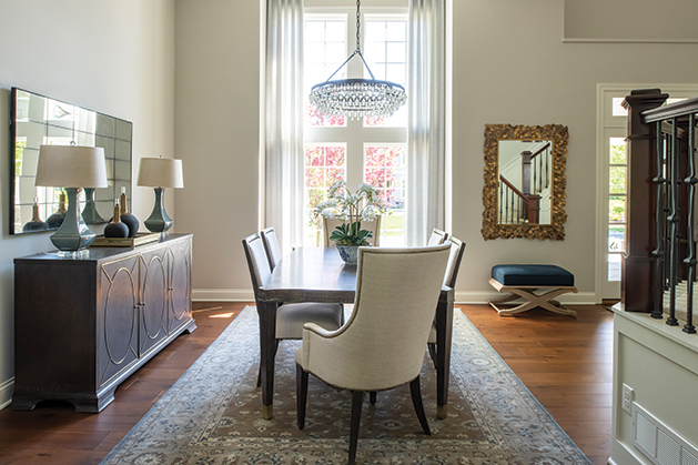
A big mistake most homeowners make with hanging art is hanging the piece too high. The art should be at eye level for average height. If you have an eight-foot ceiling, a comfortable height for the average person would be to have the center of the piece at about 57 inches from the floor. With a taller ceiling height, 60 inches is pretty standard. For over a dresser or buffet, the same guideline follows—even if these only leave four to eight inches from the bottom of the art to the bottom of the buffet. That’s OK. It’s mainly important to keep the art at that eye level.
What about over a chair rail or board and batten?
If you are hanging a large or more linear piece of art on a wall with a chair rail, it can be very dramatic and create a lot of visual texture to have the art overlap the chair rail. In the office of this home, the pieces were smaller and sat above the chair rail. To achieve that eye level hanging height, we had the bottom of the piece start at about six to eight inches from the top of the rail.
Does art always need a visual anchor?
I’d say it often depends on the scale of the room/wall. Some smaller spaces do not need a furniture anchor. They just need a pop of color or some visual interest that can be achieved in art alone. This home has a two-story foyer and benefits from the bench anchoring the mirror. It’s also a very functional furniture piece for an entry.
For lighting, what’s the general rule for over a dining/kitchen table?
You need a minimum of 30–36 inches [36 inches is preferred] from the top of the table to the bottom of the fixture. In the dining room in this home, it had such high ceilings, that we felt it was best to go higher above the table to fit the scale of the room. For kitchen islands, I like to allow for more space, more of a minimum of 36–42 inches from the island top to the bottom of the fixture. Pay attention to the quantity of lights and wattage. A dining room can have more mood style lighting with less wattage, but for kitchen pendants and casual dining rooms, it’s nice to have lots of light.
If you want to create a feeling of intimacy, is it OK to drop the hanging light lower?
Yes, and 30 inches from a table top or surface is probably the lowest we recommend. Lamps also are a fabulous choice to create intimacy. Lamps provide an ambient light that instantly warms up a space. We love doing a mix of floor lamps and table lamps in any one space, so that you’re getting a variety of light quality.
Gallery walls make a big impact—when done correctly. If done incorrectly, they can appear messy and disorganized. The key to a successful gallery wall is to have consistent spacing between the frames, specifically if you’re using just images or pictures. For mixed media gallery walls, shelving or other types of wall décor, we recommend paying attention to balance. We always lay it out on the floor first. Start in the center of the gallery, and work your way out.
Do you recommend the same color frames for a gallery wall?
[It] depends on the look you are after. Same color frames are better if you are going for a more minimalist or clean look. If you want to go more farmhouse or vintage, mix it up.